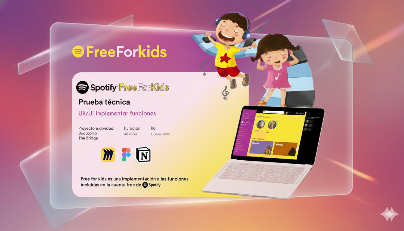
0
Facility Services companies in Spain
€10.5B annual revenue.
Digitizing Spain’s cleaning industry through mobile & smartwatch

Spain’s professional cleaning industry is vast — yet behind the scenes, most of its workforce remains invisible to digital tools.
Between outdated systems, manual reporting and limited tech literacy, what should be efficiency often becomes friction.
Everyone wanted efficiency — but not everyone wanted transparency.
“Planning is subjective. The shift manager plans based on their knowledge, which may not be accurate.”
“Connection problems and the app crashes a lot. Also, the assigned routes don't make sense.”
“My work isn’t reflected. Nobody knows how much I work. Time is running out and the logging system slows me down.”
Large. Bold. Hands-free.
UI for tired eyes. No typing required. Smartwatch for wet hands.
Hygea’s interface was designed to meet users where they are — in motion, in noise, and often with limited visibility.
Our goal: make the tool invisible, and the work visible.
")
Time Tracking
Measure time spent on every task with precision.
Tender Data
Reliable metrics to create accurate competitive tenders.
Workforce Planning
Calculate optimal number of workers and shifts.
Leave Control
Track absences and coverage with precision.
Design that includes every cleaner, not just the tech-savvy ones
The challenge
In professional cleaning, many workers are over 45. Vision issues, limited digital experience, and stress from multitasking make traditional apps unusable in real environments. Accessibility wasn’t an extra — it was the foundation.
The approach
I began with contrast, clarity, and context:
Testing what ‘simple’ means
Usability reviews with cleaning supervisors revealed that what seemed “intuitive” to designers wasn’t for everyone.
After iterations, navigation became flatter, and the main task actions —Start, Pause, Finish— were brought to the watch screen itself, not hidden in menus.

Training and onboarding
Even the most inclusive design needs context.
Hygea introduced short tutorials — one minute, no voice-over, simple gestures on the real watch.
New cleaners could replay the tutorial at the start of their shift or skip it if they already knew the flow.
Supervisors would use it during onboarding so everyone could practice before the first day.
Accessibility wasn’t only about the interface; it was about confidence and independence.
“Now I don’t need to look at my phone — just tap the watch. The short tutorials helped us learn fast, and now I can even train the new hires myself.”
Mari Carmen, cleaning team leader
Accessibility became the bridge between technology and people — a design choice that earned trust.
Design that de-risked implementation — even without a rollout
Scope & constraints
This project did not reach deployment. My role covered UX research, flows, and a clickable MVP to support funding. No production metrics were generated.
What we built
What we validated
Open questions for a real pilot
These questions would shape the transition from a validated UX prototype to a scalable product. The next step was not only technical — it was about turning insight into operational intelligence.
This is a concept video to explain the context to the stakeholders.
Selected Works